Creative Director / Campaign Strategy / Visual Storytelling
Ideas with intent.
Stories that move.
I develop campaign ideas, shape their visual direction and guide collaborators through execution—across film, motion and digital.
Riyadh, Saudi Arabia · Oakville, Canada
Founder of 24 Frames · Creative Manager at NHC Digital · BRU campaign reused across four Diwali seasons
Selected brand experience


Across in-house roles, agency collaborations and 24 Frames engagements.
About / Rami Awad
Creative judgment.
Built on craft.
I’m Rami Awad, a creative director and founder of 24 Frames. I combine campaign thinking with hands-on experience in motion, 3D, VFX and AI production.
My role is to connect the brief, the creative idea and the people bringing it to life. I develop narratives, present creative directions to stakeholders and guide execution through feedback and production.
At NHC’s Digital Department, where my formal title is Creative Manager, I develop campaign concepts and visual narratives while helping the team expand its production capabilities.
Through 24 Frames, my studio, I’ve also worked with agencies on campaigns and motion content for brands including BRU, Pears and Knorr. Earlier production experience includes contributions in 3D lighting and motion to Spider-Man: No Way Home and Ms. Marvel.
Additional work includes art direction and motion design for the Madeed Program through 24 Frames for TAM, whose client was the Saudi Ministry of Culture; and art direction for Knorr’s Authentic Meals Start Here through MIKADO and 24 Frames.
Creative leadership
How I lead creative work
Shape the direction
For Falcon Eye, I reframed a destination-focused brief around celebrating the country first. The marketing director approved the direction, with Saudi management reviewing the cultural details.
Build alignment
At NHC, I present creative treatments to marketing leadership and develop scenes through cultural and brand review, carrying agreed decisions into production.
Guide the execution
For BRU’s 2022 Times Square execution, I originated the logo-to-diya idea and directed animation and 3D artists. The client reused it across four Diwali seasons and requested a colour adaptation for 2026.
Develop capability
At NHC, I lead creative outcomes for social media and help build the team’s AI and digital production skills through practical guidance and knowledge sharing.
Selected work
The thinking.
And the work.

01 / NHC / Saudi National Day
Falcon Eye
A cinematic national journey, connecting Saudi achievement with life in NHC communities.
Concept · Visual direction · AI production & editing
ExploreClose case study
01 / NHC / Saudi National Day
Falcon Eye
A cinematic national journey, connecting Saudi achievement with life in NHC communities.
Concept · Visual direction · AI production & editing
Case Study / Falcon Eye — NHC
Falcon Eye.
A nation before a destination.
A cinematic national journey that connects Saudi achievement with life inside NHC communities.
Watch the completed film on NHC’s X account ↗- Challenge
- Celebrate Saudi National Day and NHC’s role in its future.
- Idea
- Lead with the country; bring the journey home to NHC communities.
- Outcome
- Direction approved; most proposed scenes retained in the completed film.
How I led
I challenged the destination-first treatment and developed an alternative that celebrated the country before introducing NHC’s communities. I presented the direction to the marketing director, secured approval and developed it through Saudi management’s cultural feedback. I then carried the narrative into AI production, editing and animation.
01 / Reframing the brief
Celebrate the country.
Then reveal our place in it.
The brief followed a bird across NHC destinations. I proposed celebrating the country first, then introducing its communities.
The film needed to connect national pride with NHC’s contribution to Saudi development and Vision 2030.
02 / The creative decision
One journey.
A wider story.
Establish Saudi heritage and landscapes before moving into the brand’s destinations.
Connect major developments and the country’s future through the falcon’s journey.
Let national achievement resolve in the everyday experience of home and community.
03 / Narrative development
Build the sequence.
Protect the meaning.
I developed an alternative alongside the requested treatment. Its cinematic, emotional approach won the marketing director’s approval and redirected the film.

From the film / A visual sequence


Original film frames, preserving their cinematic softness and colour grade.
04 / My role
From the idea
to the finished edit.
I developed the narrative and scenes, produced AI stills and video, edited the film and added animation.
I incorporated Saudi management’s cultural feedback while protecting the country-first narrative.
05 / Outcome
A stronger narrative.
Carried through production.
The alternative direction was approved and developed into the completed film, with the majority of my proposed scenes retained.
Music: existing song from the official Saudi National Day website; composition credited separately.
View the published film ↗The full film / Falcon Eye
Full-length film / 2 minutes 20 seconds.
End of case study / Falcon Eye
National pride. Connected to everyday life.

02 / BRU / Diwali
A familiar logo. A new light.
Turning BRU’s logo into a Diwali diya for a Times Square campaign.
Concept · Creative direction
ExploreClose case study
02 / BRU / Diwali
A familiar logo. A new light.
Turning BRU’s logo into a Diwali diya for a Times Square campaign.
Concept · Creative direction
Case Study / BRU Diwali
A familiar logo.
A new light.
BRU’s identity becomes a Diwali symbol, designed to register in seconds and return season after season.
Campaign in the world / Times Square
From the studio
to Times Square.
The closing montage of this Diwali 2024 event recap shows the BRU creative on a Times Square display.
Third-party event recap / event filming and editing credited separately.
- Challenge
- Make Diwali and BRU instantly recognisable in Times Square.
- Idea
- Transform the logo’s curved form into a diya.
- Outcome
- Client reuse across four consecutive Diwali seasons.
How I led
I originated the logo-to-diya concept and directed collaborating 3D artists in bringing it to life. The creative task was to make the festive transformation immediately readable while keeping BRU recognisable. The concept’s reuse across four consecutive Diwali seasons demonstrates its value beyond a single execution.
01 / The challenge
A few seconds.
One clear idea.
BRU needed to communicate Diwali in seconds on a Times Square display, without losing brand recognition.
The opportunity was already in its logo.
02 / The concept
The celebration
was in the logo.
I turned the logo’s curved form into a diya lamp.
The flame signals Diwali; BRU’s familiar shape and colours preserve recognition.
Detail from the finished campaign artwork.
03 / My role
Originate the idea.
Direct the execution.
I originated the concept and directed collaborating 3D designers and animators, focusing on a clear message within the display’s brief viewing window.
3D design and animation: collaborating artists under my direction.
04 / Creative decisions
Make the brand
carry the message.
Build the celebration from the existing logo.
Make the logo-to-diya connection instantly readable.
Use 3D and animation to clarify the idea quickly.
05 / Selected executions
One idea.
Different canvases.
Play the landscape, on-pack and tall-format executions in their original proportions.
Landscape execution
A warm seasonal colour treatment.
The idea on pack
The diya becomes part of the product’s identity.
Tall-format display
The supplied vertical-screen execution.
Diwali seasons
07 / Longevity
A seasonal idea.
A lasting asset.
Developed in 2022, the concept returned across four consecutive Diwali seasons with updated messaging and colours.
The creative principle
Make Diwali part of the brand itself—and make that connection land in seconds.
Rami Awad · Concept & creative direction
End of case study / BRU Diwali
One brand idea. A lasting connection.

03 / SIRHA Arabia / Identity
A local flavour.
A Saudi expression of a French culinary identity, informed by the colours and culture of the table.
Concept · Cultural research · Art direction
ExploreClose case study
03 / SIRHA Arabia / Identity
A local flavour.
A Saudi expression of a French culinary identity, informed by the colours and culture of the table.
Concept · Cultural research · Art direction
Case Study / SIRHA Arabia
A global identity.
A local flavour.
A Saudi expression of a French culinary identity, rooted in local food and culture.
- Challenge
- Give a French culinary identity a Saudi expression.
- Idea
- Retain its colour strips; build a palette from Saudi food and coffee culture.
- Outcome
- Agency-approved proposal; reported by the agency to have helped win the contract.
How I led
I developed the cultural rationale and art direction for a Saudi adaptation of SIRHA’s identity. Research into the colours and traditions of the Saudi table informed a visual system that retained a connection to the original brand. The agency approved the proposal and reported that it helped secure the contract; final implementation was not confirmed.
01 / The challenge
Keep the heritage.
Find the connection.
Give SIRHA a Saudi expression while preserving its French identity.
Its existing colour strips offered a structure for a locally inspired palette.
02 / Research into direction
Start at the table.
Build the palette.
I researched Saudi dishes, table traditions and coffee culture. Using AI-assisted colour analysis, I selected recurring hues to build a coherent palette.

03 / The visual system
Change the expression.
Retain the recognition.
I kept the original colour-strip structure and introduced the Saudi palette, making local culture part of the system itself.


04 / Art direction & applications
One rationale.
A coherent family.
I extended the research into colours, shapes and exhibition assets, with a clear rationale for the agency’s client presentation.
New presentation mockups based on the proposed identity.


05 / Outcome
Strategy the agency
could stand behind.
The agency told me that the concept and the strategic thinking behind it helped them win the event contract.
The agency approved and presented my research, concept, palette, visual language and application art direction.
Agency-approved proposal; final implementation was outside my involvement. Applications shown are proposed.
End of case study / SIRHA Arabia
Local relevance, built into the identity.

04 / PEARS / Campaign Pitch
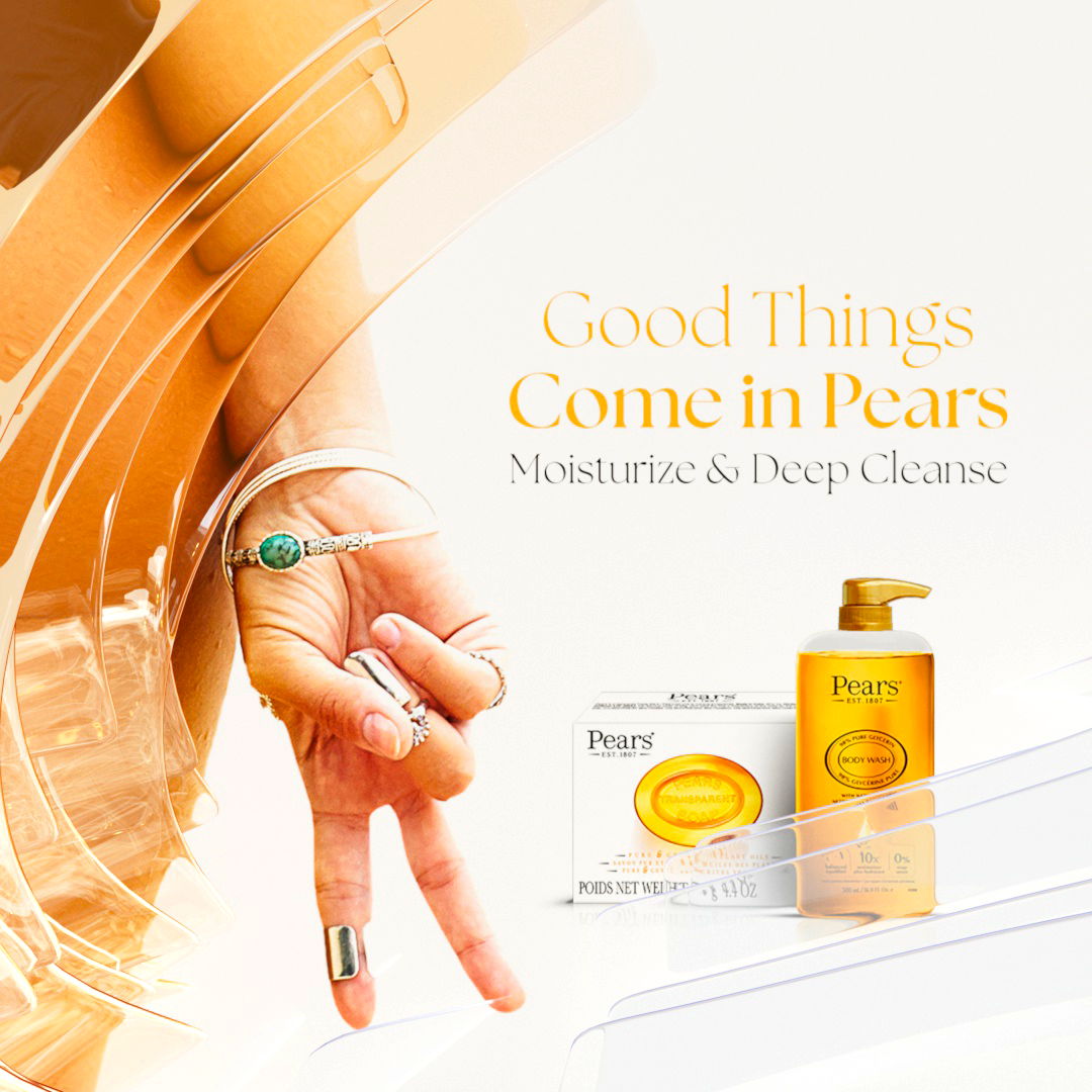
Good things come in PEARS.
A brand-name twist pairs cleansing and moisturising in a character-led campaign.
Concept · Tagline · Character & visual direction · Pitch — not launched
ExploreClose case study
04 / PEARS / Campaign Pitch
Good things come in PEARS.
A brand-name twist pairs cleansing and moisturising in a character-led campaign.
Concept · Tagline · Character & visual direction · Pitch — not launched
Case Study / PEARS — Good Things Come in Pears
Good things
come in PEARS.
Two benefits, one memorable line: cleansing and moisturising brought together through characters.
- Challenge
- Communicate cleansing and moisturising together.
- Idea
- “Good Things Come in Pears”: two benefits expressed as a character pair.
- Outcome
- Presented to Unilever; not launched following a change in strategy.
How I led
I originated the campaign line, developed the character pairing and shaped the visual narrative around cleansing and moisturising. I presented the concept to the client through the agency, showing how one idea could extend across campaign formats. The proposal did not launch after the client shifted to a global strategy.
01 / The challenge
Two benefits.
One clear idea.
Unilever wanted one campaign to communicate cleansing and moisturising.
The message needed to be memorable and show how both benefits work together.
02 / The campaign idea
The answer was
in the name.
I originated “Good Things Come in Pears,” using the brand name as a play on “pairs.”
The wordplay united the copy, characters and campaign narrative around two complementary benefits.
03 / Character & story
Make the benefits
work together.
I gave each benefit a character. Their relationship turns cleansing and moisturising into a visible story.

04 / Proposed campaign expressions
One creative platform.
Different expressions.
The pitch extended the line and visual direction into brand and social executions.


05 / My role & outcome
Originate the platform.
Make the pitch tangible.
I developed the tagline, characters, narrative and visual direction, and presented the concept to the client.
The pitch did not launch: the client shifted from a US campaign to a global approach covering multiple products.
From the original pitch / Product & design



Proposed applications / Mobile & retail


Original pitch designs and mockups; campaign not launched.

End of case study / PEARS
Two benefits. One memorable brand idea.
Selected experience
Across disciplines.
One creative perspective.
Riyadh · October 2025–Present
Campaign concepts, narratives, visual direction and AI video production; practical guidance to develop the team’s capabilities.
Remote / New York · January 2025–September 2025 · Engagement through 24 Frames
Digital campaign visuals, motion and social content, from concept through production and platform adaptation.
Remote / Denver · 2023–2024 · Engagement through 24 Frames
Motion and digital campaign direction for Unilever brands including Knorr, Pears and BRU.
Toronto · 2022–2023
Cinematic lighting and compositing for animated broadcast content.
Toronto · 2021–2022
3D lighting and motion contributions to productions including Spider-Man: No Way Home and Ms. Marvel.
Remote / Denver · 2020–2021 · Engagement through 24 Frames
Riyadh · 2013–2019
Motion design and art direction for advertising and brand communications, combining 2D/3D design with animation and visual storytelling.
Let’s connect
Start with
a conversation.
Creative direction · Campaign strategy · Brand storytelling · Motion, 3D & VFX · Generative AI